Aldus PageMaker on the Apple Macintosh
While resurrecting a 40-year old defunct magazine, I accidentally-on-purpose resurrect a 40-year old software rivalry.

In life, there are love affairs and there are marriages.
Deluxe Paint was (and is) an amazing, beautiful piece of software. It taught me so much about color, texture, and painting with light, but more specifically it opened my eyes to the possibilities of digital art as a medium. Yet, as much fun as I had, I never became a digital painter, I don't really do any pixel art these days, and over time the passion faded, never truly gone, but certainly diminished. A love affair.
In college, with a declared major in electrical engineering, I took a chance at writing for the school newspaper, at the urging of my English professor. I was hooked from the jump, caught the reporting bug, and learned the ins and outs of journalism. Over the next four years, I became adept at Aldus PageMaker, the heart of our student media production process, fascinated by its ability to amplify the written word. It was because of PageMaker I switched majors to graphic design; we stuck together well into my professional career. A marriage.
Sometimes these retrospectives are fun peeks into the past, opportunities to understand computing history a little better. Other times, I'm revisiting a condemned old house I used to live in, in a town I abandoned, finding and dusting off a forgotten jewelry box, inside which sits a tarnished wedding ring. What we had was beautiful, once.
With this exploration, I'm honestly not expecting to rekindle any deep love for PageMaker. It taught me much in my youth, lessons I've taken to heart over the years and carry with me to this day. Still, you never know, maybe there's something yet to learn. Only one way to to find out.
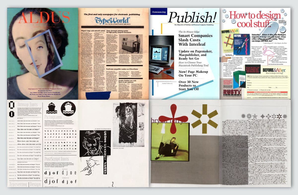
Historical Context
Testing Rig
- Basilisk II v1.1 on Windows 11
- Mac IIci w/68040 CPU, 64MB RAM
- 1024 x 768 24-bit color
- Macintosh System 7.5.5
- StickyClick v1.2
- Suitcase 3.0
- Adobe Acrobat 3.01
- Microsoft Word 5.1a
- StuffIt Deluxe 5.0
- GraphicConverter 2.2
- TTConverter 1.5
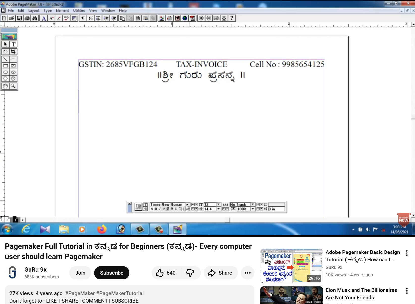
- Aldus PageMaker 5.0a
This was the last version released under the Aldus label. Soon thereafter, Aldus merged with Adobe, and this was re-released as Adobe PageMaker 5.0a.
Let's Get to Work
I have a very specific project in mind this time around. No, "project" is not quite the right word. It's not a project, it's a calling.
Many years ago, one Mr. Robert Charles Joseph Edward Sabatini Guccione had a dream. That dream? : to compete against Hugh Hefner's Playboy magazine for dominance in the adult erotica print landscape. His dream expanded into a hotel staffed by Penthouse Pets and visited by Saddam Hussein. The dream grew further still into an X-rated box-office bomb starring Malcolm McDowell, Helen Mirren, and Peter O'Toole. Good times.
Guccione's eventual wife, Kathy Keeton, had her own dream: a kind of Penthouse magazine, but for the mind. It was to be a heady packaging of art, literature, and investigations into science and the paranormal, presented on high-gloss paper, with a design sensibility that promised intellectual value well beyond the $2.00 cover price. Heck, the liberal use of spot-color metallic ink in every issue was itself worth the $2.00.
Edited by Frank Kendig, with Art Direction by Frank Devino, issue one of OMNI Magazine hit newsstands with the October 1978 issue, around the time of the debuts of the Speak & Spell, Intel's 8086 processor, and Space Invaders. As Bob Guccione wrote in the premiere issue's "First Word" publisher's column, "This then, is the editorial promise of OMNI - an original if not controversial mixture of science fact, fiction, fantasy, and the paranormal."
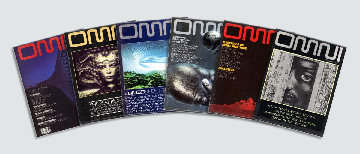
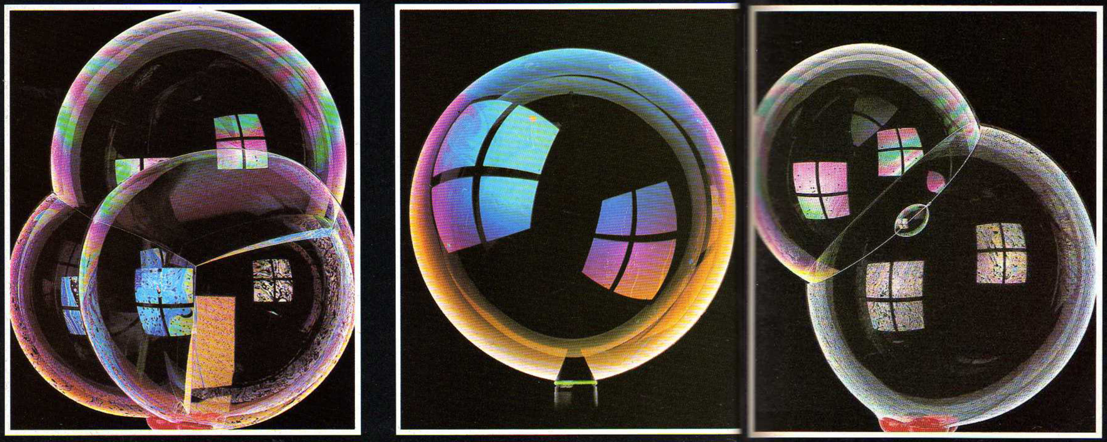
The first issue set the table neatly. A story about scientific advances in age-defiance, fiction from Isaac Asimov, an interview with Freeman Dyson (he of the Dyson Sphere joke), and artistic photography of soap bubbles all combined to take the reader on a magical journey of enlightenment. It worked on me at any rate.
OMNI's print run ended in 1995, with flaccid attempts to reanimate its corpse over the years. A new issue appeared on newsstands in 2017 with a cover design I will charitably call, "I guess they tried."
That was a cheap shot, and I need to be cautious throwing stones here, as I am about to make my own attempt at designing OMNI Magazine. My name isn't Christopher Hubris Drum for nothing.
The low-down on paste-up
Launching into PageMaker brings back a tidal wave of memories. Good lord, the volume of Diet Coke I drank during long production nights back in the 90s! Even now, Command-D to place an image is as reflexive as breathing. If I mentally prod at the inner crevices of my brain matter, the rest of the expert knowledge appears to be long gone.
Considering PageMaker from a digital native's perspective, its tools and way of thinking can be quite anachronistic. Today, we enjoy a kind of fluidity in page design, worrying about things like "reactive design" with flexible, auto-adjusting layouts. That was not such a concern to early desktop publishers, except in coarse-grained measures. What they really needed was a bridge for the mental divide between manual paste-up and the new digital hotness.
Consider the tools of the trade at the time: X-Acto blades, point tape, light tables, non-reproducible pens, rubylith/amberlith, vellum, wax machines, PMT machines, photo typesetters, and just so much paper. All but the paper were replaced with a mouse.
A fantastic video showing someone doing manual paste-up, just to give you a sense of the dramatic sea change desktop publishing introduced.
PageMaker provides a digital equivalence to a physical pasteboard. Much like other software I've looked at, especially in the word processing arena, the "Don't worry! Yes it's on a computer but we've reproduced a metaphor you understand" approach informs a lot of decisions behind its interface and tool-set.
Everything you do is "manually digital" if that makes any sense? User actions are similar to the pre-digital workflow, it just happens on a screen instead of a light table. For example, there are no tools to assist with positioning elements relative to one another. There is no real concept of "layers." There is no such thing as "grouping." If you want text in columns, you must manually lay those down, one at a time.
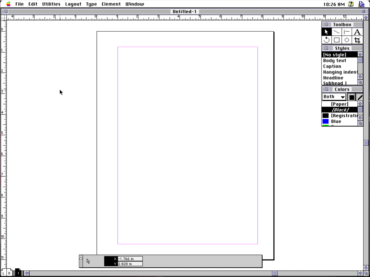
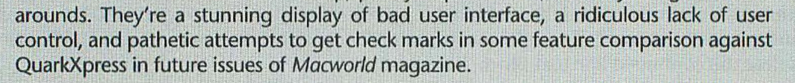
So here's our blank page in PageMaker and the palettes which are ready to assist. We have a Letter-sized page, outlined in black, with default margins in pink and purple. In the bottom left are L and R icons for the left and right "master pages" (elements that will be included on every left or right page, respectively) and a little 1 page icon showing that this is a 1-page document and we are on page 1. I really love the cute little pages in the scroll area; it's so easy to immediately jump to a specific page or spread.
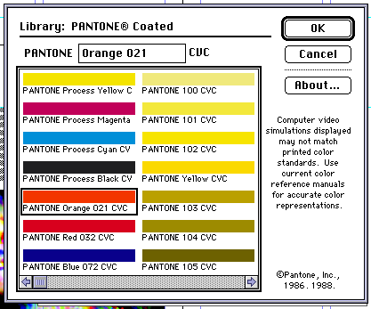
It's all so simple, it's kind of impossible to forget how to use it. Toolbox does what it says, offering the selection arrow, lines, text, object rotation, boxes, circles, and image cropping. Styles has pre-built paragraph styles, which can be modified to meet your design spec, and which can "cascade" by basing styles on other styles. Colors are of your own mixing, or can be pulled from licensed libraries, like Pantone, Toyo, Trumatch, and others. There is also a Library palette, for storing reusable objects in your publication, and which utterly failed me in my tests.
It might be hard to wrap a modern mind around it, but that's basically it for the palettes. They don't dock with one another (that would come in the Adobe era). There are no hidden sub-palettes. There's just what you see: tools, styles, colors, and the one at the bottom, a context-sensitive "control palette." This is either a merciful culling of modern palette madness, or a frustrating barrier to artistic expression, depending on which side of 2000 you were born on.
Interestingly to me during my early poking around in the tools, it isn't so much that I find myself wishing for more palettes, so much as I just want a refinement of these. As a simple example, notice what is not inside the palettes? There's no method for creating new colors or styles, for example. Those are separate options under the Element and Type menus, respectively. A little + button would be nice.
While re-familiarizing myself with the forgotten contours of the program, I'm remembering how great the control palette is. It debuted with PageMaker 4 and completely changed the usability of the program.
Control freak
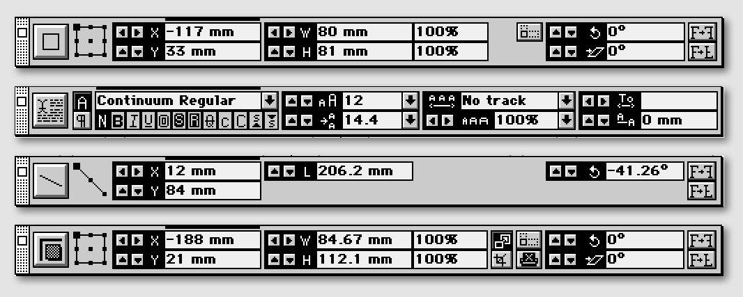
In the image above you can see how the control palette morphs itself to show a core set of commonly used functions specific to the currently selected tool, represented by the left-most icon: box, text, line, and image (top to bottom). The palette gives live stats and mathematically precise control over most aspects of each tool.
I find the control palette so adept at handling 90% of what I need to do, I basically don't touch the menus of the program. If color selection could be worked into the palette in some fashion, that would handle another 9.9% of what I need.
The controls for numeric positioning are not just useful, they're basically required. Trying to position anything with precision by hand is futile, which reveals a letdown. The palette shows in real-time a dragged item's position on the page. When dragging out a guideline from the ruler, we can see where that guideline will fall when released. However, I just said that positioning by hand is futile, and guidelines need high precision.
Yet guidelines in PageMaker are special, delicate creatures treated with unique rules. Unlike everything else, guidelines are not page objects and so, they cannot be selected for editing. We can grab them and move them around, but we cannot just click-select one. If we can't select it, we can't fine-tune it with the control palette. It's the one thing we need precision for, but it's the one we're denied.
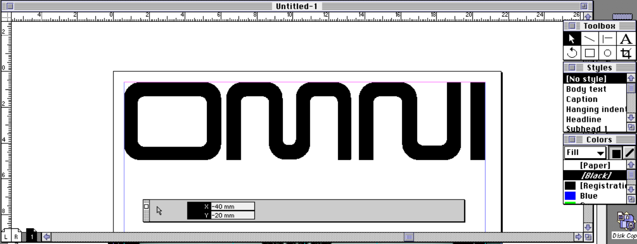
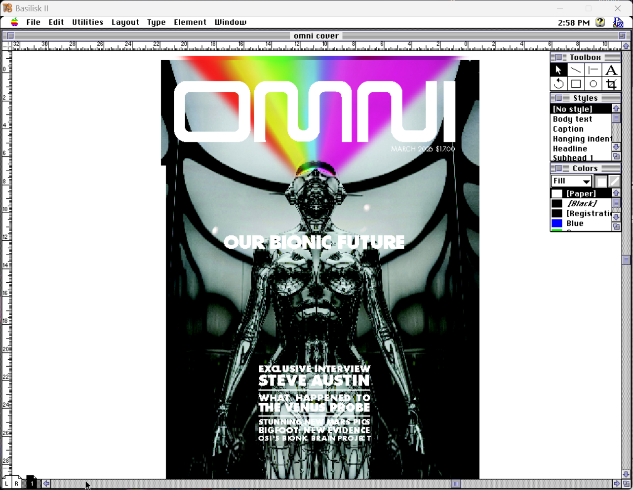
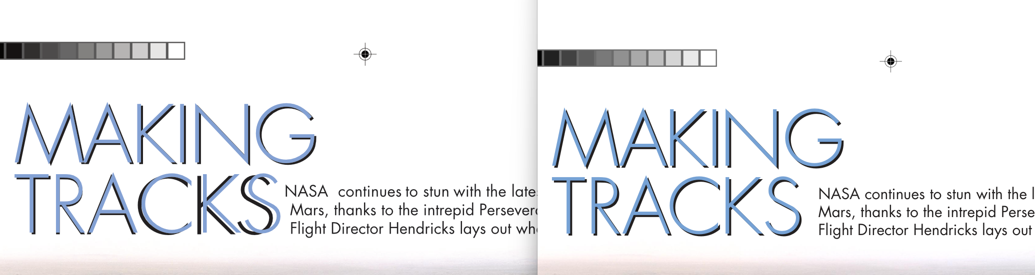
This blank page is driving me crazy. Let's get a masthead on there, so I can at least pretend like I'm a real designer for a moment.
Using the control palette to set the masthead. (measurements derived from here)
Layer cake
Continuing to think of PageMaker as just a big area for building collages out of raw material, this means it also doesn't have any concept of layers. Things are layered, but to find something in a stack means sifting through the stack item by item to reach the desired element. This is PageMaker's biggest flaw, and proves frustrating time and again. To be completely fair, when Aldus PageMaker 5 released in 1993, Adobe Photoshop was at version 2.5 and didn't have layers either. Photoshop wouldn't get layers until version 3, in 1994.
Bring to front and Send to back. That's all you get for adjusting z-position of page elements. Have fun!It's particularly frustrating because the simple act of clicking on elements can bring them to the front automatically, as with the main cover image. Once I have it in place, I often find it is obscuring the masthead. So I have to Send to back over and over and over again, with every accidental click. That happens a lot, because PageMaker misunderstands my click intent quite frequently, clicking "through" my desired object into the background image. That jumps the image to the front, and here we go again.
This brings up another issue, which is there is no way to "lock" objects into position. Everything is loosey-goosey and free-form, again mimicking old-school paste-up methodology (I recall dropping paste-up boards and losing a carefully arranged layout or two back in the day). That adherence to the old ways makes sense to me for PageMaker 1 and 2. By version 3, I think the digital nature could have been better explored. By version 4, it absolutely should have been. By version 5, it feels like weaponized incompetence.
There is a clear reason QuarkXPress enjoyed a reported 90%+ market dominance in desktop publishing by the time PageMaker 6 came around. Simply put, they embraced the future of layout, not the past. Until they didn't, but that's a story for another day.
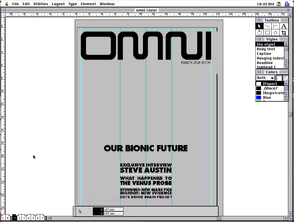
Now to flesh out this cover a bit more.
Eye of the beholder
One thing that takes getting used to is how much of the design occurs in our imaginations. The screen is simply too small and too low-resolution to know with 100% certainty that what we see is what we want. That's one reason the control palette is so invaluable, is because we can know with mathematical certainty that an object is where we intend, despite what we see on screen when zoomed out.
Like EA developing the IFF file format for the Amiga community, Aldus likewise developed TIFF (tagged image file format) to unify image handling on the Macintosh. TIFF was the image standard for continuous tone images in publishing on the Mac, bar none.
Of course, images fit for print were pretty heavy objects for the RAM restricted Macintoshes of old. Lightweight 72dpi images might have been fine for the screen, but 300dpi was needed for output to Linotype for final camera-ready artwork. Here's a dpi vs. lpi explanation, in case a digital-only workflow has shielded you from learning of it.
The cover will need a 9" x 11.5" image at 300dpi in CMYK. Using the only PageMaker-recognized compression method LZW, that's a 20MB file and PageMaker only requires 3MB to run. It's efficient at what it does, but something's gotta give.
In PageMaker we can link to TIFF files (embedding is also an option), with three on-screen preview options: greyed out, normal, and high resolution. Your choice will depend on your system and complexity of layout. If things are chugging too hard, step down. Turn on high to get it right, then turn back to grey to avoid the ulcers of slow screen redraw on your Mac SE. This may still be taxing to early systems, but we have another option.
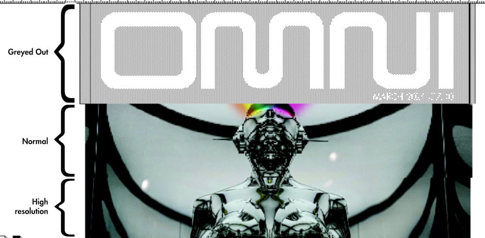
A common practice in the day was to use FPOs, "For Position Only" images. Those were low-resolution proxies, good enough for a designer to marry text and graphics with some degree of confidence without stressing her computer. After delivering digital files to the printer (oftentimes literally handing over floppies, SyQuest, or Zip disks in person), a process for swapping FPOs with print-ready high resolution versions of the same images was available to the prepress team. Design in low-rez, output in high-rez.
For OMNI, the only printer I have available is the coin-operated color laser copier at the convenience store, so I'm not overly concerning myself with "press ready" on this. However, I don't want to make things artificially easy on myself either. There is no art without pain, as they say.
Get the lead out
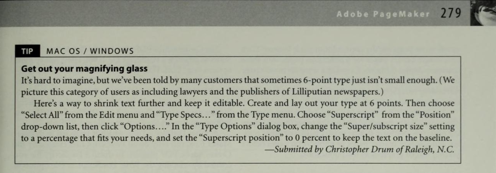
In reading about the origins of PageMaker, and interviews with and about Aldus's founding by Paul Brainerd, it seems he was a real stickler for typography. Of note, he pushed hard for things like typographer's quotes (curly vs. straight), and so within PageMaker there are quite a few options for setting type "just so."
Typographer's quotes can be toggled on a document as the default. Text tracking, leading, baseline shift, and kerning are all settable in precise increments by the control palette. Letter-by-letter kerning is also easily achievable through Control+left/right arrow to set nice, tight TA pairs (a little Guccione callback joke for you there).
Despite Brainerd's self-professed love for good type, the Quark crowd lamented PageMaker's typographical controls. One area in which QuarkXPress and Ventura Publisher had innovated were the tools for laying down columns of text. Those used a "text box" methodology, which is pretty much the standard today. A box could be drawn, delineating an area of the page which should hold text. That box could then be set up to contain columns, gutters, insets, a frame and so on, and the text would flow within accordingly. Move the box and the internal formatting moves with it. It makes too much sense, and so PageMaker doesn't do that.
PageMaker kicks it old-school, forcing us to put down guidelines on the page that show where columns of text should fall, nay where they could fall if one were so inclined. They're mere suggestions, really, and it is up to the designer to place the text within those guidelines, or not. This kind of adheres to the concept of using a grid structure for a page, where the grid can be used rigidly or fluidly, as the designer may choose.
Using an OMNI scan for measurements, I've set up a template for two-page spreads.
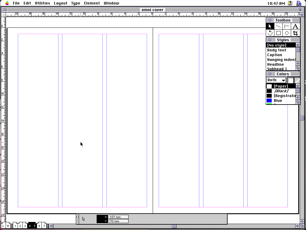
Notice how column guides fill the page top to bottom. Left and right can have different column counts, but a single page cannot. With the box layout methods of Quark and company, if we want to split the layout into 4 columns on top and 3 on the bottom, we can draw two text boxes and assign respective column counts.
To do the same thing in PageMaker, we have to set the page to 4 columns, lay out the 4 columns, then change to 3 columns, and lay those out. This kind of futzing about is the drum-beat of using PageMaker, a rhythm of "set a value, do a thing, change that value, do the next thing, reset the value, do another thing" which my muscles have remembered long before my brain does.
Book it
PageMaker offers a few tools for wrangling long-form publications. The story editor is a lightweight, built-in word processor, with spell check and find-and-replace. Styles can be applied in its stripped down text view, which aren't visible until exiting the story editor, but are annotated in the margin. It's nice not having to jump out of PageMaker just to do a quick edit.
Throwing everything together into a monolithic document can be unwieldy. It's a far sight better to break the publication into separate documents for work by various contributors simultaneously. File > Book... will let us link multiple individual documents into one larger, logical construct. Select a set of files, reorder them into their book order, and away you go.
Once those document relations are set, we have a number of tools for helping our reader navigate the tome. A table of contents can be auto-generated, thanks to paragraph styles. Turn on the "Include in table of contents" flag for any given style to get table of contents coalescing for free. The formatting options will probably get you about 60% of the way toward a final layout.
Setting a "next style" for each paragraph style lets me simply type to automatically receive a perfect column header. This exists in page layout software even today; see, we weren't completely hopeless back then! I can't one-shot an "OMNI perfect" table of contents, but it's a good starting point and saves me from annoying minutiae, like laying down 1-point rules.
Automatic page numbering is also available, by positioning page number placeholders on our master pages. When collated, each document will receive the appropriate page numbering relative to that document's position in the complete book.
How about a nifty end-of-book index? It, too, can be auto-generated, though it requires good planning and forethought. Highlight a piece of text and promote it to an index entry with Utilities > Index entry... Show index... gives you an opportunity to tweak the data which drives the index layout, and Insert index... will generate a text block containing a neatly formatted index.
Such an index might need alphabetical ordering, or perhaps some kind of topical ordering, and both are possible. Tools for setting up index topics, and the rules for PageMaker to follow when extracting that data, are available to ease the pain. It takes some playing around, testing the waters, to really get how the pieces fit together into a final index, but proves to be a fairly robust, data-driven solution to a logistical nightmare.
A link to the present
PageMaker accepts a wide variety of content types. Various word processor formats, graphic formats in both raster and vector (in EPS format), and even Lotus 1-2-3 and dBase data can be imported, for those worried I wouldn't tie things neatly back into previous posts. With all of the various pieces on the page, we need to be able to make sure they're linked to the right source documents and stay up to date as our team makes changes.
For a while, there was a publish/subscribe mechanism on the Mac, which danced on the edge of OpenDoc ideas (but was not related, to my knowledge). PageMaker supports this, functioning as a "subscriber," and it is up to other applications to function as data "publishers." If you know OLE on Windows, you know what I'm describing here.
Once subscribed to a component, which could be as hyper-specific as a single word from a Microsoft Word document (I tried it before I claimed it!), PageMaker will sense changes to the source data and prompt the designer to keep it up to date. This won't help if the change alters the length of the text and forces a reflow, or if the shape and dimensions of the graphic require a new text wrap. Also, any styling previously applied to the subscribed element will be lost, and will need to be re-styled to match as before, after an update.
"Technically, this all works," he said with a shrug.
Honestly, I find it annoying, both to set up and to utilize. PageMaker interrupts right in the middle of working on something else to announce updates to subscribed elements. The Links panel already lists everything placed into the project with each link's update status. It also lets me one-click update all links globally, on my own time, at my own pace, when I'm ready. It's unobtrusive and puts the control back into my hands.
Publish/subscribe? More like PUNISH/subscribe, am I right folks? the audience boos, pelting me with unopened copies of Microsoft BOB
Separation anxiety
I don't need to dig into this too much, because it's very much a "going to press" feature, and a vigorous interrogation of pre-press technologies falls far outside the scope of this article. In the context of the desktop publishing wars, it is important to note PageMaker's constant catch-up to Quark in the professional arena. Where Aldus was initially content to appeal to a "making flyers at home for church fund-raising bake sales" kind of crowd, Quark had gone for the professional jugular.
Generating separations, the component cyan, magenta, yellow, and black layers that, when combined in ink on paper build our final image, was a major missing component of a robust publishing strategy. Or at least that was true until QuarkXPress 2 in 1989, itself contemporaneous with PageMaker 3.
Around 1992, Aldus attempted to staunch the bleeding of users to Quark. PageMaker 4.2 came bundled with a standalone application for generating color separations, called Aldus PrePrint. As one review said, "It does the job." I can hear the yawn that accompanied the sentiment.
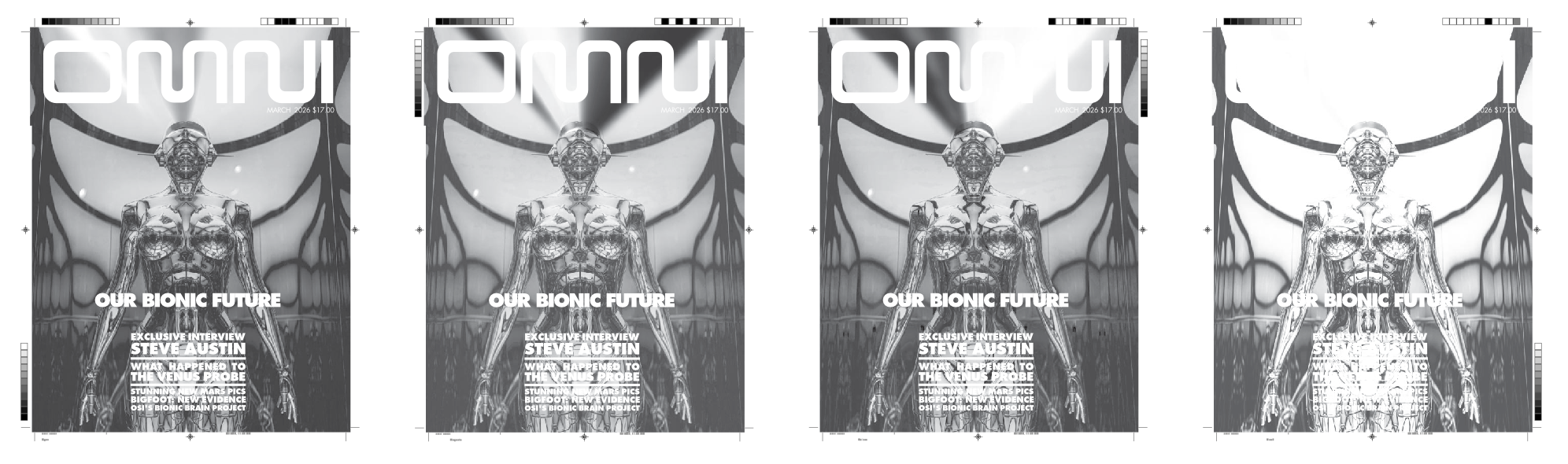
Finally, four years after QuarkXPress 2, PageMaker 5 integrated color separation generation into the application proper. CMYK and spot color plates can intermingle, plate order can be assigned, colors can be set to overprint/knockout, and line screen/angle are all adjustable. It's all pretty coarse-grained though.
For example, adjusting for dot gain on uncoated paper stock, removing color cast, grey color removal, adjusting plate levels and curves to compensate for a finicky press; situations like those are far more suited to sophisticated tools like Letraset ColorStudio or even Adobe Photoshop, after it gained CMYK control.
For simple, basic, day-to-day separation needs, especially for those on a budget, PageMaker 5 does a fine job; an assertion I can illustrate with a clever video.
I brought the PDF into Affinity 3, tinted each separation and set those to "multiply". Dragging them together simulates the final printing effect. I'd say those separations look accurate.
Extensions envy
Having made the effort to catch up to QuarkXPress with its color separation utilities, Aldus had further catching up to do with Quark's plug-in architecture. What Lotus 1-2-3 "add-ins" did for spreadsheets, Quark Xtensions did for desktop publishing.
Aldus had to keep their ball in play, and so introduced Aldus Additions with version 4, expanding the breadth of bundled tools in version 5. In practice, using the tools reveals how weak Aldus's retort to Quark was.
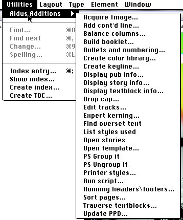
For example, PageMaker 5 adds the ability to "group items" through an Addition. Hooray! "PS Group It" and "PS Ungroup It" kind of do what they state, except all selected items must be completely contained within the current page boundaries. If anything sticks off into the pasteboard, it cannot be grouped. Additions are, put simply, a mess of a solution to a real problem. MacWorld PageMaker 5 Bible concurs.
Where Aldus kind of dropped the ball, third-party Additions didn't do much to make up the slack. The biggest package, and one I remember using, was Extensis PageTools for about $100 in 1994. A visually heavy, kinda Microsoft Word 5-esque toolbar with lots of geegaws and whoozits, character-level styles (PageMaker only did paragraph-level), find and replace colors, visual thumbnail document navigator, and more formed a grab bag of solutions to a variety of random PageMaker annoyances. It's not nothin'.
Impact printing
While I was researching the history of desktop publishing, one word came up again and again: democratization. Desktop computers would ostensibly simplify formerly specialized skills into tools so simple anyone could use them. This would drive down production costs, opening print publishing to a wider audience. It occurred to me to do a Google N-Gram search and this graph in particular got me thinking about democratization a little more. I wasn't doubting the truth of it all, per se, but the chart gave me a "this needs further investigation" itch I needed to scratch.
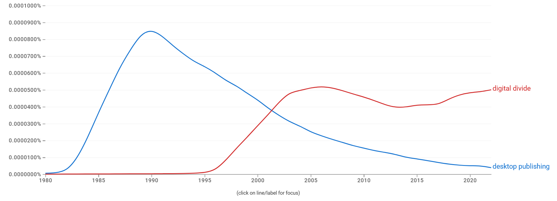
Searching for "social impact of desktop publishing" turns up surprisingly little, at least in the way that I mean it. There is a good amount of information on the technical side of the discussion, extolling the virtues of PostScript and the cost/time savings gained by the new desktop tools. But we see in the chart that talk of the "digital divide" followed desktop publishing's hype cycle. Those two didn't seem to get a lot of time to chat with one another.
The birth of desktop publishing, the rise of personal laser printers, and the rapidly lowering costs of powerful personal computers all converged to lower the barrier to entry into publishing. There's no denying that. There are many stories talking about production times being cut in half, or typesetting costs being cut by up to 90%. PageMaker: Desktop Publishing on the Macintosh, by Kevin Strehlo, noted that traditional typesetting could run up to US$400/page in 1989, about US$1,000/page in 2026 dollars. 90% off ain't 50% bad.
"Cheaper than ever before" doesn't necessarily mean "cheap." In 1985, a Macintosh 512K ($3,195; $9,700 in 2026) + LaserWriter ($6,995; $21,000) + PageMaker v1.2 (w/PostScript printer font support, $495; $1500) cost over US$30,000, in 2026 money. Even without the LaserWriter, that's $10K. I can appreciate the dramatic reduction in costs, but personally I would still be priced out of joining that revolution, even if I "acquired" certain tools through "alternative means."
Everything I read about the impact on publishing seems to be from the point of view of publishing elites, and the CEOs of the companies involved. Brainerd would often recount a story about a church that was able to do print runs of 600,000 units thanks to PageMaker. Dan Putnam, Adobe employee #2, called out a risqué lesbian newsletter, and a fundamentalist Christian newsletter as examples representing the breadth of materials PostScript helped enable.
If we're talking about empowerment and democratization, I don't particularly want to get that information secondhand from corporate execs. Join me then, won't you, on a small audit of desktop publishing's impact on the rest of us, and let's try to get a sense of how the "revolution" was seen by those who fought in the streets.
1991 Soviet Coup D'etat
Sometimes, the revolutionary street fighting was literal. In 1991, Communist Party of the Soviet Union hardliners attempted to wrest control of the country away from Mikhail Gorbachev and newly-elected president Boris Yeltsin. During the coup attempt, Gorbachev was stolen away and newspaper presses were locked down.
According to Brainerd's obituary in GeekWire, Aldus PageMaker played a role in defanging the "Gang of Eight," the core hardliners who staged the coup. As an alternative way to get the pro-democracy word out, flyers carrying Yeltsin's message were created in PageMaker (the story goes) and photocopied for mass distribution.
"During the coup in Moscow all the presses had been shut down. Boris Yeltsin commandeered an HP printer, a PC, and a copy machine. There were pictures of Yeltsin surrounded by people with their hands outreached, trying to get copies of documents that were all produced in PageMaker. Its really a powerful image. It made me very proud," Brainerd said in Inside the Publishing Revolution: The Adobe Story, by Pamela Pfiffner.
Brainerd's obituary states that Aldus later ran an ad with the tagline "We helped create a revolution." That ad ran in the... in the... huh, where did that ad run, anyway?
Its existence is corroborated by ex-Aldus employee Gabi Clayton in a Facebook post after Brainerd's death. She recalls having a copy by her desk, but doesn't have it any longer. I looked high and low for the tagline and couldn't find it in archive.org, Google Books, nor the internet at large. My best current guess is that it ran in Aldus Magazine, whose digital archives are almost non-existent.
20 years ago, Computer History Museum did an interview with Brainerd in which he mentioned neither the event nor the ad whatsoever, which was a strange omission, in my opinion. At the end of the interview, he's asked if he has materials to donate to the CHM, which he affirmed. I checked the CHM online archive and found nothing, so I reached out to see if Brainerd ever followed through on that donation.
CHM responded saying that he had indeed done so and they would scan the materials at my request. I have no idea if the ad is amongst those items, and am waiting for the results. I will update this article if new information comes to light.
In the meantime, I thought I'd look through print materials associated with the coup, looking for some tell-tale sign of desktop publishing's involvement in the production of revolutionary materials. That would be a quite literal "democratization" artifact; democracy was precisely what they were fighting for!
Harvard keeps a small selection of coup-related materials online for perusal; you can check that stuff out here. I may have found something that matches the story.
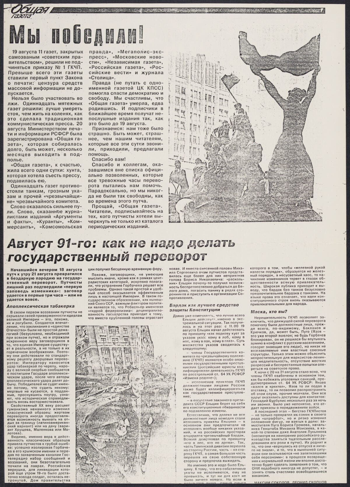
I cannot say "this was done in PageMaker." However, if translation tools are to be trusted, this is a celebration of the failure of the coup attempt, including a mocking piece about "How not to stage a coup d'etat." If you've ever tried to do manual text wrap, you'll know that what we see in that sample could only be done digitally. Full text justification with hyphenation, and the slightly staggered baselines (probably shifted due to subhead leading) feels very PageMaker, especially since I encountered the same issue in my OMNI project. It also appears to be a photocopied handout, which matches the publishing methodology of the resistance.
It doesn't prove PageMaker, per se, but it definitely tingles my spider senses.
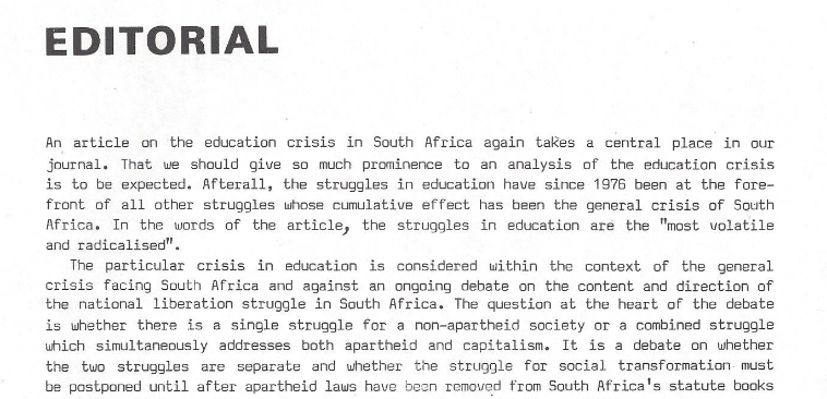
Apartheid South Africa
Sometimes its very easy to see the before and after of desktop publishing on a publication. A typical layout in smaller publications was a literal typewritten page published as-is, like this example from an early issue of Azania Worker. Columns? Bah, who needs stupid columns! (please don't make us manually type out columns!)
Later, Azania Worker explicitly called out their transition to desktop publishing for tightening up the layouts for their anti-apartheid publication. Bob Symes is credited with handling that, and a hallmark of early struggles with digital typesetting tools, and over-trusting of "forced justification" is evident.
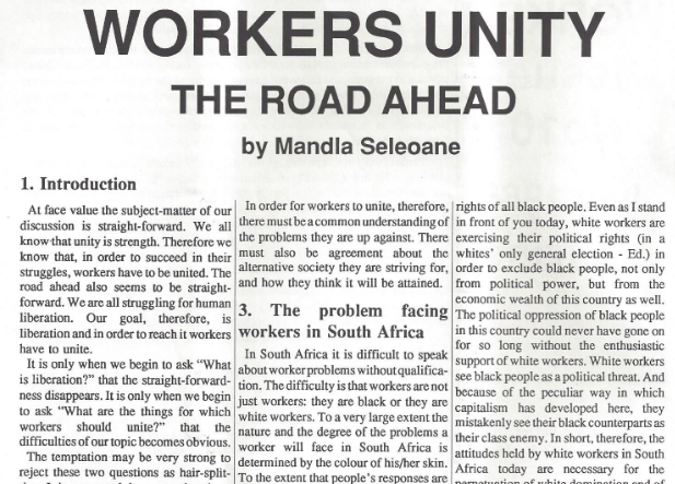
I remember distinctly playing around with kerning and leading to make articles fit into given spaces in the student newspaper. If an article were a few lines too short, that was nothing an increase in font size or leading by 0.1 points couldn't fix. The overly-tight tracking in the example suggests that cutting text was not a consideration. They were determined to fit every important word into the limited space available, evenifitmeantmakingeverythingruntogether.
The price of freedom of the press
A desire to join the desktop publishing revolution was expressed across a few publications I peeked through. As I suggested earlier, pricing still shut some groups out of enjoying the new tools of the trade. It would take more time yet for prices to fall enough to open the doors wider and let more people join in the fun.
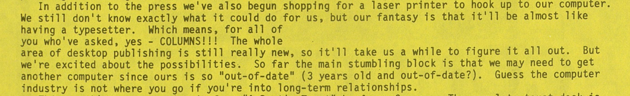
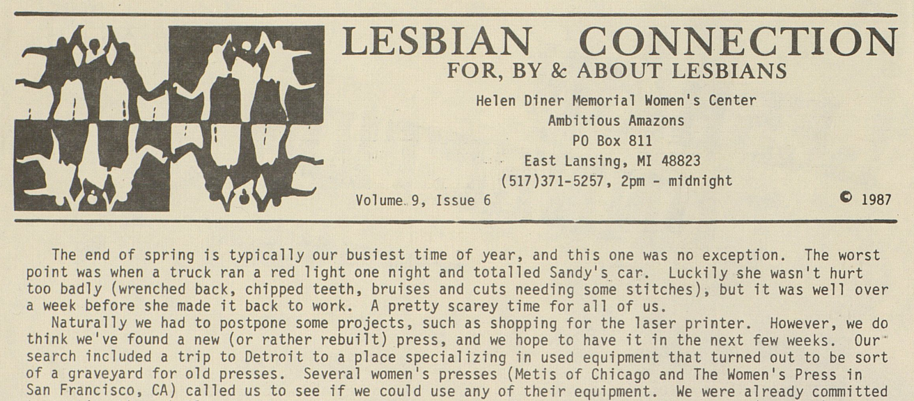
Lesbian Connection struggled to figure out how to afford to give the people what they wanted, nay demanded: COLUMNS!!!
The author then lays out the costs and is excited to deliver. Let's look at the next issue and see those beautiful, highly-demanded columns at work.
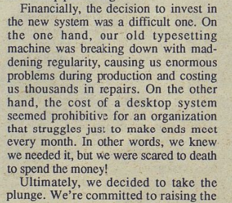
Oh, well, maybe next issue?
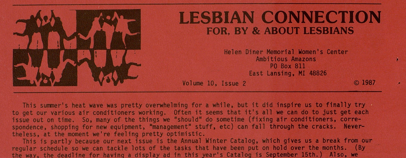
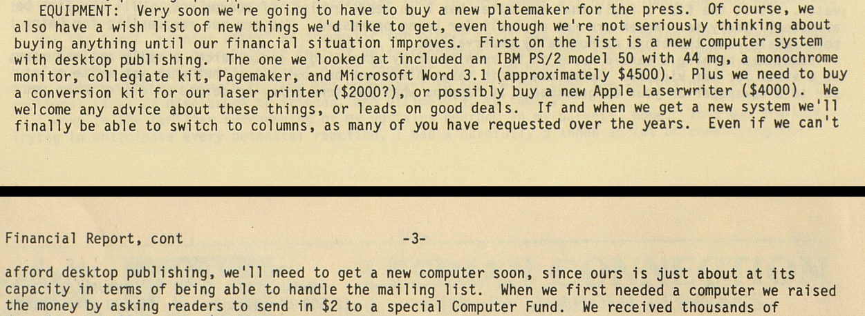
I won't drag this gag on any longer. Over the next two years no transition occurred. The reason for this is explained to their column-desiring audience: it was still too expensive. Even budgeting for a PC over a Mac, and with laser printer costs having cut in half or more over the years, the savings still weren't enough.
This publication continues to this day, and as they're on the web they clearly made the transition to digital production. But when? Online archives of the print edition stop before that happened. I need closure on this story!
I reached out to the editors and tried to make a case for helping me learn when the transition occurred. It seems to me that it would have had a big hullabaloo, something like, "You demanded it for 20 years, so we're proud to bring you columns!" Unfortunately, my journalistic persuasion skills seem to have atrophied, and I didn't get a response. Maybe someday I'll find out how and when their readers received the columnar layouts they so craved, nay deserved.
The Zine Scene
Zines, "blogs in print form" I suppose I'd call them today, were and still are an interesting subculture of the publishing scene. Unapologetically hand-crafted, sometimes constructed as literal collage on the kitchen floor, topics ranged from personal ramblings to the adventures of a man who wanted to wash dishes in every state. I defy you to tell me that story wouldn't trend on Hacker News today.
In Notes From Underground: Zines & the Politics of Alternative Culture, author Stephen Duncombe noted a tension for zine makers trying to incorporate desktop publishing into their workflows. The editor of William Wants a Doll, Arielle Greenberg, struggled to use desktop publishing "in a way that didn't dehumanize her zine." Lizzard Amazon, editor of Slut Utopia, wrote, "it is not so hard to use pagemaker," but, "i am still going to write all over this thing in pen at the last minute." and apparently she did.
Zine culture is steeped in anti-establishment, rejecting utterly the trappings of mass produced media. It is supposed to be an antidote, a vaccine against anything that smacks of corporate influence. The tools of desktop publishing offer democratization of professional layout tools, yet the author suggests that very democratization runs counter to the zine ethos.
When the tools are democratized, and by extension homogenized, maintaining the expression of authenticity becomes harder, if not impossible. Duncombe concludes that the internet and web publishing, more so than any of the print desktop publishing tools before, actually fulfilled the original promise of democratization. But, at what cost?
"In the zine scene we preach the ethics of DIY and democratic creation but the experience of self-publishing on the Internet demonstrates that when everyone begins to express themselves then there isn't the scale or coherence that encourages the formation of an alternative world-view."
Rejection letter
Every technology has its naysayers. Some, like the anti-generative-AI crowd, are right, and just, and 100% correct to fight the dumb AI companies and not let them turn everything we love into room-temperature mayonnaise like the flat-out wrong information that keeps turning up in search results when I'm just a guy trying to do his best to inform his readership about ancient publishing practices and the history of those technologies and is it so terrible to want real information and....
Ahem, excuse me. Let's start again.
In the HyperCard article I noted Sheldon Leemon's reactionary stance to all things hyperlinked, "Do we really want to give hypertext to young school children, who already have plenty of distractions?" Similar naysaying naturally accompanied the advent of desktop publishing.
Even those who acknowledged the benefits still felt some sense of loss. As the editor of Tradeswomen said, "we don't have nearly as much fun."
It is hard to impress upon a digital-native, remote-only workforce just how fun physical production was. The late nights, the mishaps, the heartaches, the triumphs, of a team united around putting an issue to bed, all felt earned. In the end, when real newspapers hit the newsstands and students and faculty were reading it over lunch, every person on staff could point to something specific in every tangible artifact and state, "I did that."
Font of knowledge
Before I close, it's important to acknowledge font handling vis-a-vis desktop publishing back in the day. Font management, printing, and on-screen rendering could be a real struggle at times, so it needs at least a little discussion. I will do this by way of confession. Woz forgive me, for I have sinned, I cheated throughout this post. I used... ah, I'm almost too embarrassed to admit this...
I used TrueType fonts. Hold your comments until I've made my case! John Warnock, don't pout!
Fonts for the original Macintosh started life as font "suitcases," a special folder which held system resources and a collection of hand drawn bitmap fonts at various sizes. Susan Kare kept it real. If a font wasn't explicitly drawn at the size you wanted, it would scale to match your desire, which could result in ugly, chunky, pixelated on-screen text.
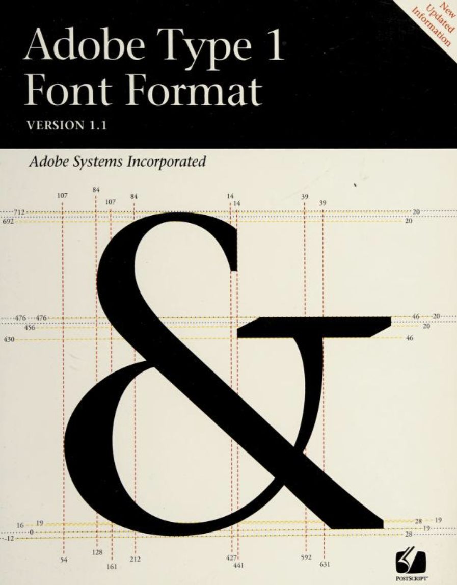
PostScript fonts could, at the very least, print nicely even when the on-screen representations were ugly. PostScript had two commonly-used font types: Type 1 and Type 3. Type 1 was Adobe's crown jewel, the font standard that included what we know today as font hinting, as well as a coveted secret recipe which Adobe refused to share at the time (see the timeline for more details). Type 3 was a more open, but inferior standard, and didn't include Type 1's secret sauce. For a time, it was the only option to font vendors who didn't want a licensing agreement with Adobe. Put simply, Type 1 fonts looked better in print.
The gulf between on-screen representations and printer output was vast, and TrueType promised to fix that. Announced at Seybold 1989, it's core selling point was a single font file that could provide both a clean on-screen representation at any size, as well as sharp printer output. Inside the Publishing Revolution says, "Gates claimed that TrueType's quadratic splines were far superior to PostScript's Bezier curves." Warnock was beside himself, calling it on stage, "the biggest bunch of garbage and mumbo jumbo," and "on the verge of tears, he said, 'What those people are selling you is snake oil!'"
Adobe's immediate response was two-fold: one, open up their proprietary Type 1 spec for all to use, license-free, and two, the development of Adobe Type Manager, a system control panel that used PostScript Type 1 font definitions to generate crisp, clean on-screen representations.
Once more from Inside the Publishing Revolution, "David Lemon recalls the "manic" pace of (ATM) development (after the Seybold shock), "They'd look at me and say, 'It's not life or death if we get this out. It's only the future of the company.'" Working at a breakneck pace, Adobe brought ATM to market at least a year before any TrueType fonts from Apple or Microsoft appeared. "If we hadn't gotten ATM out then, we would be living in an all-TrueType world now.""
Their beachhead fortified, ATM became the must-have extension for every Macintosh I ever touched; TrueType fonts were kind of snubbed by the Mac design community, is my recollection of those times. All of that said, when sending modern fonts back in time onto older Macs, TrueType has proven to be the path of least resistance by far.
I feel irrational shame for using TrueType in this project, eschewing ATM. Forgive me for taking the coward's path!
Object permanence
Alright, it's time to make this OMNI dream a reality, and get these ideas out of the computer and onto paper. I'm excited!
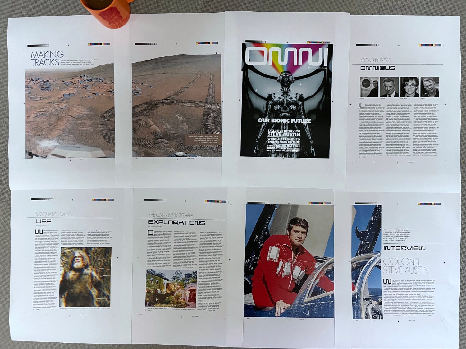
Everything you see was generated as PDFs by Adobe Acrobat Distiller 3.1 from PostScript generated by Aldus PageMaker 5.0a. I copied those PDFs over, untouched and unedited, and printed them as-is to the convenience store copier.
First, I need to explain the chill that ran down my spine when I held those prints in my hands for the first time. Here was something tangible, something I crafted myself made physically manifest. I have done this in the past hundreds of times, but I'd forgotten the rush. It was a great feeling.
I think this makes the case that design work can be done with PageMaker. Of course it can. It was used in the past, so why wouldn't it be able to continue to do what it was built to do? With Acrobat Distiller, we can generate PDFs that print perfectly on modern systems. Done and done.
Would I choose to use it today? No way.
The text workflow is too much of a PITA to do anything longer than a few pages; I almost can't believe I used to lay out 80-page magazines in it. The Additions are a fumbling mess. Guideline management is bumpy, although an Extensis Addition can smooth that a little. While I love the Control palette, the palettes in general need yet more refinement to become truly useful, time-saving features.
Clicking on images and having them automatically pop to the top of the stack, without having any control over layering, is one annoyance too many. This is a case where you really can't go home again. I mean you can, but you're going to wonder, "Were the walls always this greasy? Did the toilet always back up like this?"
PageMaker literally altered the course of my life, steering me from electrical engineering into graphic design. It was fun at the time, being new and exciting, but offers little today except as an exploration of the opposing forces at work during the "desktop publishing revolution." I am struck by one curiosity, however.
I've been working as a professional software engineer for 20 years. With one exception, everything I've built professionally is gone. The companies folded, the apps were discontinued, contracts were ceased, the products the apps promoted were killed, and so on. There are any number of reasons, but they all converge at the same result: my professional digital legacy has been, will be, erased.
Everything I published with PageMaker still exists.
It's physically in the archives at UNC-Charlotte. It's framed on a business owner's wall when she was featured on the cover of Business Leader Magazine. It's sitting in a box in someone's attic waiting to be rediscovered.
It is often said that what goes on the internet is forever. Yet every digital work I produce lives in someone else's infrastructure, subject to someone else's decisions about what is worth keeping. The work I produced on "bird cage liner" remains free to this day, and no popped stock bubble, no digital decay, no coup d'etat, can stop those ideas from propagating, once let loose in the world.
Looks like PageMaker had one more lesson to teach me, after all.

A gift! A gift comes!
Thanks for reading all the way through. I have a reward for your effort.
You may have noticed the OMNI font I used in the layouts, Continuum. Its possible the web crawlers have found it by now, but most likely you won't find it easily until then. It is, in fact, my gift to you.
Before I started this blog, I built it from scratch in Affinity and FontForge, using OMNI Magazine as the sole source of truth for all shapes, default leading, and kerning pairs. It was just a for-fun project, to learn how fonts are created and to see if I could get it working on the machines of my youth. There's no point to my gatekeeping it any longer; it's time to set it free.
You can grab Continuum on my personal GitHub. I accept bug reports and pull-requests, so long as they are backed by real, in-print proof that a change is warranted. Be aware, the goal is not to make a font "inspired by" OMNI, it is to be the OMNI font, full stop. Maybe you can help me get it there.
https://github.com/christopherdrum/continuum
Sharpening the Stone
Emulator improvements
- The Basilisk II emulator itself is solid and I don't have any real issues with it, once I had it set up following precisely the Emaculation instructions.
Troubleshooting
- Getting the emulator set up this time around was quite frustrating. Some of it was inadvertently a quagmire of my own creation. Some was just easy to overlook. Some was just plain craziness.
Unless you really understand Classic Macintosh systems and how they work, I would recommend building a new VM hard drive from scratch for your DTP work. My disk image carried over from the Hypercard article, and I was rather cavalier with my installs on top of that. This caused nothing but pain, including crashing apps, odd PostScript generation, and more.
A full reinstall of System 7.5.5 was step one. That gave me a base system, which I backed up as a "pristine" starting point for the future. Then, installing apps one by one with testing at each phase helped establish pristine "checkpoint" images I could use as starting points for future projects. - If you go for a PageMaker 5.0a installation, be absolutely certain to install the "RSRC patch" files. They are easy to overlook, but are absolutely critical. They fixed my PostScript rendering offset bugs.
- I don't recommend installing Distiller 3.01 on top of 3.0. I did that and something went wrong, resulting in a flaky application. A pristine install of Distiller 3.01 worked great.
- This is the biggest frustration with Basilisk II on Windows (apparently other platforms don't have this issue). Once installed, PageMaker wouldn't copy anything. I could copy from any other application, and I could paste into every application, including PageMaker. But I couldn't copy anything while in PageMaker. The helpful experts at the Macintosh Garden forums got me straightened out. It seems that on Windows, the system clipboard (
Settings > System > Clipboard > Clear clipboard data) must be flushed for copy/paste to work properly in Basilisk II. You'll have to do this again and again while using the program, if you jump out of Basilisk II into Windows and back again. Very annoying.
Interfacing with the Real World
PageMaker native files are not compatible with anything that exists these days. However, the PostScript PageMaker generates works fine with Distiller on classic Mac and Ghostscript on modern systems. The resultant PDF files in either case printed perfectly on a Sharp MX-3631DS color copier.
There may be a conversion path by opening PageMaker 5 files in PageMaker 7, then finding a copy of InDesign CS6 or prior. CS6 should be able to open the PM7 document, thereby converting it to InDesign format. It should technically be possible to open that converted file in a more modern copy of InDesign. This setup requires access to software I simply don't have, so this is my best, educated guess.
Affinity 3 could open the PageMaker PDFs as well, but exhibited a text rendering bug that wasn't found in any other PDF viewer, modern or classic, nor in the final print. I have reported it to the developers.
Fossil Record